Flexbox
Flexbox is a one-dimensional layout method for arranging items in rows or columns. Items flex (expand) to fill additional space or shrink to fit into smaller spaces.
flex model
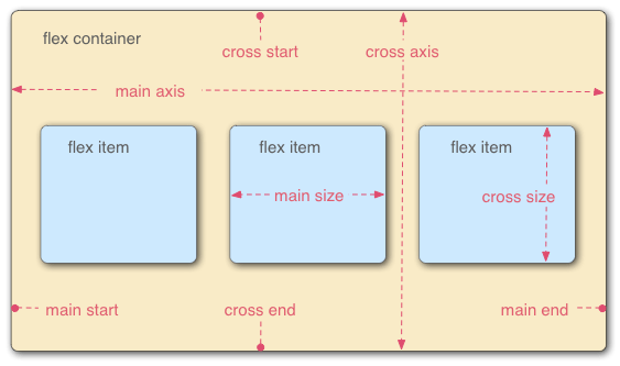
The main axis is the axis running in the direction the flex items are laid out in
The cross axis is the axis running perpendicular to the direction the flex items are laid out in.
The parent element that has display: flex set is called the flex container.
The items inside the flex container is called the flex items.
The width or height of a flex container or flex item, whichever is in the main dimension, is that box’s main size.
The width or height of a flex container or flex item, whichever is in the cross dimension, is that box’s cross size.
Use flexbox display
1 | .box { |
This cause box class element to be used as a flex container. Its child elements become flex items.
Flex container properties
- flex-direction
- flex-wrap
- flex-flow
- justify-content
- align-content
- align-items
Flex item properties
- order
- flex-grow
- flex-shrink
- flex-basis
- flex
- align-self
Flex container properties
flex-direction
flex-direction specifies which direction the main axis runs. row is the default direction
1 | .box { |
Demo
flex-wrap
The flex-wrap CSS property sets whether flex items are forced onto one line or can wrap onto multiple lines.
- nowrap(default)
- wrap
- wrap-reverse
1 | .box{ |
Demo
flex-flow
flex-flow property is a shorthand for the following CSS properties:
- flex-direction
- flex-wrap
1 | .box{ |
Demo
justify-content
The CSS justify-content property defines how the browser distributes space between and around content items along the main-axis of a flex container, and the inline axis of a grid container.
Default value is normal. It behaves as start when applied to a flexbox.
1 | .box { |
Demo
align-items
The CSS align-items property sets the align-self value on all direct children as a group. In Flexbox, it controls the alignment of items on the Cross Axis.
align-items is similar to justify-content but along cross-axis.
values are
- normal(default)
- stretch
- start
- end
- flex-start
- flex-end
- self-start
- self-end
- baseline
- first baseline
- last baseline
- safe center
- unsafe center
Demo
align-content
This property only takes effect on multi-line flexible containers. It has no effect on items in a single line.
The CSS align-content property sets the distribution of space between and around content items along a flexbox’s cross-axis or a grid’s block axis.
1 | .box { |
Demo
Flex items properties
order
The order CSS property sets the order to lay out an item in a flex or grid container. Items in a container are sorted by ascending order value and then by their source code order.
Demo
flex-grow
The flex-grow CSS property sets the flex grow factor, which specifies how much of the flex container’s remaining space should be assigned to the flex item’s main size. Default is 0.
flex-grow is used alongside the other flex properties flex-shrink and flex-basis, and normally defined using the flex shorthand to ensure all values are set.
1 | .item { |
Demo
flex-shrink
The flex-shrink CSS property sets the flex shrink factor of a flex item. If the size of all flex items is larger than the flex container, items shrink to fit according to flex-shrink.
In use, flex-shrink is used alongside the other flex properties flex-grow and flex-basis, and normally defined using the flex shorthand.
1 | .item { |
Demo
flex-basis
The flex-basis CSS property sets the initial main size of a flex item. It sets the size of the content box unless otherwise set with box-sizing.
1 | .item { |
Demo
flex
The flex CSS shorthand property sets how a flex item will grow or shrink to fit the space available in its flex container. It is shorthand for flex-grow, flex-shrink 和 flex-basis.
default is 0 1 auto
1 | .item { |
Demo
flex is very useful when you want an element to take the remaining of the space
align-self
The align-self CSS property overrides a grid or flex item’s align-items value. In Grid, it aligns the item inside the grid area. In Flexbox, it aligns the item on the cross axis.
1 | .item { |
Demo
It is useful when you don’t have control over the parent container’s align-items property. For example, to stretch the element to take all the length along the cross-axis, use align-self:: 'stretch'
1 | align-self: 'stretch' |
Example
Centering content using css box
1 | .box { |